In my original post on Visualizing Technology Flows from Patent Data I just presented static information – flows for a single year. As I said there:
The next step is to watch how these flows, and the relationships implied by them, have evolved over time. We can do this by plotting the same graph say, every 3 years, from 1975 up until the present.
At the time I had already coded up, and computed, snapshots for each year. However, considerations of space, as well as a desire to find a way to display the information in a ‘nice’ (animated) form, warranted a separate entry. After what, as usual, has turned out to be a rather longer delay than intended, I’ve finally got round to having a first stab at this using simple animated gifs:
Animated Citation Flows 1975-1994 (1994 base year) (click through for full-size ~ 2MB). Click here to rerun the animation.
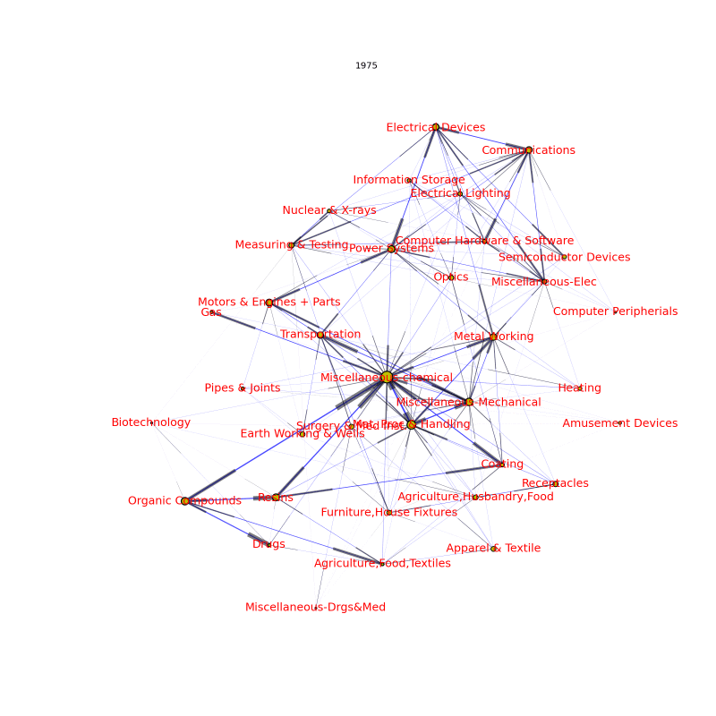
Here I’ve fixed the layout of the nodes based on the final year (1994) flows. I’ve also done quite a lot of tedious playing around (if only one had stylesheets!) with edge and node sizes to try and improve the look and they are still far from perfect (NB: this means edge/node sizes differ slightly from the images in the original post). As before:
- Size of nodes indicates total citation flows from that area in that year
- Yellow portion is citations back into that subcategory while black represents portion that is into other subcategories (comparison by area).
- Direction of flow is indicated by an arrow head (a rectangular block) with size of flow measured by width of edge and size of head.
Note that we are displaying year values not cumulative values – so, for example, links between nodes may get smaller or even disappear from one year to the next. What jumps out from this?
- The substantial increase in flows over time (most obviously seen in the size of the nodes).
- (At least based on examination by eye) no great change in the balance of these flows between cites outside and cites within a category (relative sizes of black and yellow in nodes).
- Growth has varied substantially across areas (largely, I would hazard, in line with the no. of patents in that area). In particular, the “Computer/Electronics” cluster (top-right) has grown substantially faster than the “Chemicals” sector at centre-left. Individual categories showing especially marked growth include: Biotechnology, Computer Hardware and Software, Communications, Information Storage, and Drugs.
- It also looks like some areas have grown more strongly linked and “clustered” over time (e.g. Computer/Electronics, and Drugs to Organic Compounds) though it is hard to tell from this visualization (pointing to the need for more formal techniques …).
- Something which is very clear from the visualization is that there is significant year-to-year variation with clear drops in flows in some cases year-on-year
I also computed another version where the network layout is based on that year’s flows – rather than with a fixed layout based on a given base year.
Unfortunately, this looks too “busy”, particularly as the sensitivity of the network layout algorithm (networkx.graphviz_layout) means that categories move around a lot. (To save on space – the files are big – I haven’t posted this up but if anyone is interested let me know and I’ll upload it).
One solution to this would be to move to rendering cumulative, rather than per-year, flows. This might also improve the base-year case: even there, it might be more natural, at least from a visual point of view, to display changes in flows over time via their impacts on “stocks” rather than displaying the “flows” themselves.
So, next steps:
- Plot cumulative flows
- Write up a more formal analysis based on e.g. PCA. I’ve already done PCAs on individual years and an animation might be interesting.
- Do animations right: the proper way to do this with would be with a proper “slider” widget and stop/start control. It looks like this should be pretty easy in javascript using e.g. jquery but it doesn’t look to be trivial – if it is please let me know how! (BTW: I know I could use Flash but it’s proprietary …).