Last week someone pointed me a paper of Angus Deaton’s (released in July) entitled Income, aging, health and wellbeing around the world: Evidence from the Gallup World Poll. As the title indicates, it uses a cross-country dataset from Gallup to look at well-being and its relation to income, age and health (I note that sadly the Gallup data looks to be proprietary – unlike the data from the World Values Survey which has been the prime data source for previous research on cross-country happiness research).
Deaton’s paper has been getting a lot of attention and the main reason for this, apart from his stature as an economist and the excellent proprietary dataset, is that, in contrast to much previous work, he finds a robust relationship between self-reported life-satisfaction and national income (of a log-linear form):
“Each doubling of national income is associated with a near one unit increase in average life-satisfaction measured on an eleven point scale from 0 (“the worst possible lifeâ€) to 10 (“the best possible lifeâ€). If anything, the effect of national income on national happiness is somewhat stronger in the rich countries than in the poor countries. [p. 4]
Note that life-satisfaction was measured by the Gallup survey using the following ‘ladder question’:
imagine an eleven-rung ladder where the bottom (0) represents “the worst possible life for you†and the top (10) represents “the best possible life for you.†Respondents are then asked to report “on which step of the ladder do you feel you personally stand at the present time.†[p.6]
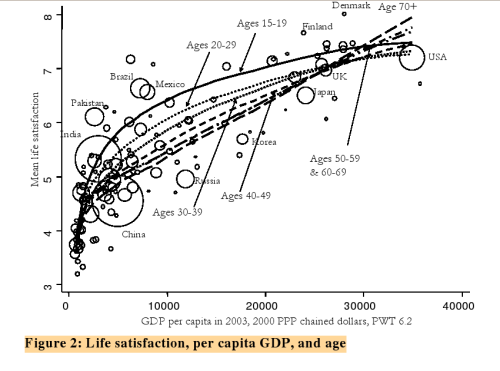
One can see this result most clearly in Deaton’s Figure 2: Life satisfaction, per capita GDP, and age (p.40) reproduced below:
Other interesting items include the fact that recent growth in national income lowers well-being:
“Recent growth in national income, unlike income itself, lowers average life-satisfaction. This result appears to be new, and contradicts much earlier literature that argues that improvements in living standards make people better-off, but that the effect wears off over time.” [p. 4]
Deaton’s results certainly are interesting, and as he says, this dataset will be a fertile source of analysis well into the future. For the time being my main questions are:
1. How much are Deaton’s different results on well-being compared to previous work due to the use of a different survey question? For example, most of the existing cross-country (primarily based on WVS data) produce plots very similar to the one above (e.g. see the plot on p. 32 of Layard’s Happiness).
2. Deaton’s data are cross-country thus they tell us about how well-being is evaluated relatively by different individuals in different countries at the same time. We already have fairly robust evidence that within a society happiness does relate to wealth (though wealth here may be proxying for status or some other valuable good) so this is perhaps not that much of a surprise. What would be more interesting is to look at changes in happiness for the same society (or even better the same individual) as income changes over time. Thus my question here would be: does repeating this kind of analysis across time rather than across space yield the same results (i.e. that well-being is robustly related to wealth)?